Latest News and Events
2012 Presidential Election Visualizations

The Presidential election day in 2012 was full of emotion on Twitter, following an intense set of exchanges from both parties in the concluding month. Once again, similar to the Sandy visualizations we posted a few days ago, many visualization enthusiasts released their visualization onto their websites. Below is a list of some interesting visualizations performed.
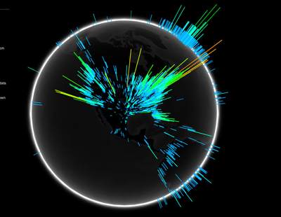
Visualizing.org - Here is a 3D visualization of the globe with data points on where the tweets came from and their content, whether it was directed about one of the candidates and whether it was a positive or negative comment. It allows you to spin the globe around to see around the world to get a picture of the social reactions posted.
The Guardian's Map - An interactive map that allows you to dig down into the county specific results. For those that are interested in having this data to do some of your own visualizations, download it here (also contains other visualizations.
Scoop.it Map Morphs - Ever wonder what the US map would look like if each state were morphed to a size that reflected the amount of money spent or the number of electoral votes? This site shows a very fun and interesting view on exactly that.
CNN's Facebook Insights - This one allows you to view Facebook post statistics which can be filtered by age, gender, time and location. Do what you can with it since the visualizations across the different criteria groupings look too much alike, since the line graph contains a huge spike on election day.


